APPISKEY · UX/UI DESIGNER · 2021–2023
I DID
The discovery research and some of the design work.
THE TEAM DID
The rest, and we ran a lot of interviews together.
Discovery
MY PART
9 months
SPRINT
89+
SCREENS WIREFRAMED
App Store
LIVE TODAY AS THE VI PEEL APP
THE PROBLEM
The original app was glitchy and the directions were confusing. Users got lost and often went back to the paper pamphlet in the kit.
WHAT I DID
I did the discovery: competitive research, a lot of interviews with customers and staff, and a journey map that showed where people dropped off. I also designed part of the app, from 89+ wireframes to mockups for onboarding, the homepage and a diary for tracking progress with notes and photos. Stakeholders didn’t help us reach the existing user base for user testing, so we also worked from a persona named Sophie, a busy marketing coordinator who wants clear, easy steps.


THE USER
Sophie is a marketing coordinator in Los Angeles. She recently moved there and is proactive about her skin, but her job and active lifestyle leave her little time to research products. She wants direct, easy to follow steps and an all in one solution. She is looking for something effective that won’t burden her wallet, and a routine that fits a busy life. She has been let down by over the counter products that didn’t live up to their promises, and finding the right products and application steps adds to her frustration.
THE GOALS
Three goals guided the project. Clear and intuitive navigation, so users can find what they need and stay focused on their skincare journey. A step by step guide that breaks the peel into small steps, each with a short description, visuals or videos. And accessibility, with attention to color contrast, font sizes and compatibility with assistive technologies.
THE DESIGN
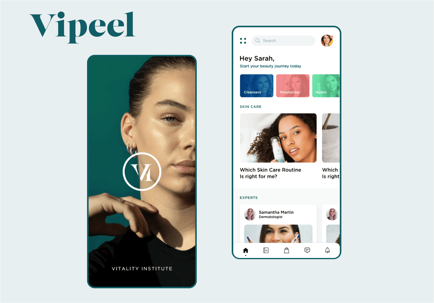
The new onboarding draws people in with simple sign up options and a guest mode, so they can look around without sharing personal information. The homepage shows what the app offers with minimal design and bold color. The diary lets people track their skin’s progress with notes and photos. The color palette is lively on purpose, to make the skincare journey feel positive and uplifting.


IF I DID IT TODAY
The first app sent people back to the paper pamphlet. Today I would make one screen do the pamphlet’s job: one step, one timer, one button. This is a sketch I drew for this page, not the shipped app.
STEP 3 OF 7
Leave the peel on
04:30
Keep your face still. Do not rub.
I’m ready for step 4
One step at a time. The pamphlet showed every step at once and the app was glitchy. Here each screen holds one step, so nobody gets lost.
The timer is the screen. The peel only works if you follow the timing. A big timer replaces checking the pamphlet.
Readable by everyone. Bright colors stay for buttons and progress. Text sits on plain backgrounds with strong contrast, in a large size.
Test with the real users. Stakeholders did not open their customer list to me. Today I would ask the clinic to hand patients a test link at their appointment.
THE OUTCOME
There are no results to report for this one, so the work is the proof: the research, the journey map, 89+ wireframes and the mockups. Today the VI Peel app is on the App Store, guiding patients through their peel. If I kept going, I’d add product recommendations based on skin progress and reorder reminders.
GET IN TOUCH
studio.sharonepoole@gmail.com
linkedin.com/in/sharone-poole